- Animated Emails. This week there are a couple examples of Animated GIFs used in email. These come to us from Saks Fifth Avenue and Art.com.
An animated GIF file is a graphic image that moves. This could be a flashing or spinning icon, or letters that magically get larger, for example. Technically, an animated GIF is a single file that is created to display various images in a specific order. Animated GIFs are most frequently used in web ad banners, but there has also been a recent surge in the use of animated GIFs in email. One interesting use, beyond flashing letters or moving icons, is creating what looks like a video embedded in the email content. These “videos” present a visually unique and impressive message, and when used effectively, create visually engaging emails that deliver a “wow” factor that stagnant images cannot. To really catch the attention of email openers, be sure to place the most interesting animated GIFs above-the-fold.
The Saks example provides some eye candy of different styles on different models.

The art.com example displays various educational prints dynamically.
 Here is the art.com dynamic image in action.
Both of these dynamic examples are classy and draw attention to the email. Sweet!
- Overstock.com does something interesting in order to get the click. They have a $10 Off Coupon for a mystery product. The only way to see the product is to click the image. Also, the subject line for this email was Shhh! It's a Secret Sale. This subject line is reinforced in the email and on the landing page once the coupon is clicked.
 ...and here is the product! This is a great way to get subscribers interested and engaged with the email.
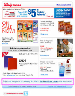
- Walgreens has a prominent banner at the bottom of the main image asking the subscriber to update his or her preferences to receive more email. This type of overt request to signup for various types of newsletters is not something all email marketers are comfortable doing. Some marketers feel that this is overly aggressive. However, in this case Walgreens does a good job. It states that hey, if you enjoy this email you will probably enjoy some of our other emails.
 Here is a larger view of the call to action image. Walgreens also asks if the subscriber would also like to update or add a preferred store.
Here is the landing page once the image is clicked. The four email types can be selected. This landing page/preference center is simple and clear.

- Sephora.com does something cool. They give a preview to what the topic of the next email will be. This makes me want to check my in box for the next Sephora email. I am not necessarily interested in the email content, but I would like to find out if they actually deliver what they are promising in their next email. This is a great idea to boost open rates and hopefully clicks and conversions.
As an added plus, if I really cared about who the Sephora top brand founders were I am more likely to get exited about their email and might tell my friends and family about the upcoming mailing.

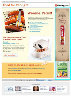
- Cooking.com does something that I have not seen in email for a long while. They have actual banner adds in the HTML mailing. This is a throwback idea when email marketing was in its infancy. I am curious to the reason why they are doing this. Is it to increase revenue through an affiliate program? Do they think this will help their email program? Did they run out of content and figured might as well place an advertisement? I'm not sure...


No comments:
Post a Comment